10/8/2026
Product BasedPivot Table in Excel: Turn Rows Into Answers
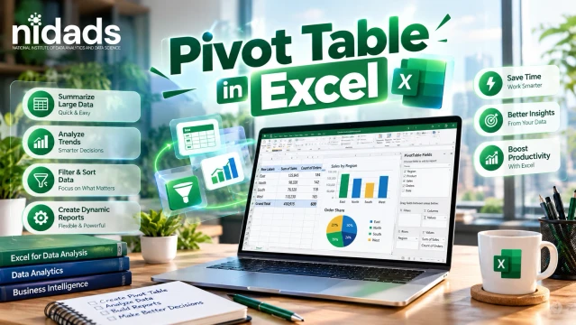
Table of contents
Pivot Table in Excel: Turn Raw Rows Into a Decision-Ready View of Your Data
A Pivot Table in Excel is a tool that summarizes large data without formulas. You drag fields into Rows, Columns, Values and Filters, and Excel groups your data and calculates totals, counts or averages. Use it to compare categories, spot trends and build reports in minutes.
Key Takeaways
- A Pivot Table summarizes rows of data into a small, clear report.
- Rows and Columns set the layout. Values set the math. Filters set what is included.
- Clean data with one header row gives correct results.
- Slicers, timelines and PivotCharts make reports interactive.
- Refresh the Pivot Table after the source data changes.
- It summarizes data. It does not clean it.
What Is a Pivot Table in Excel?
A Pivot Table is a report built from a source table in Microsoft Excel. It reads your rows, groups them, and applies a calculation. Your original data never changes.
Aggregation means combining many values into one number. Example: 500 orders become one total per region.
Start with three rows:
Region Product Sales
North Laptop50000
South Phone35000
North Phone28000
Put Region in Rows and Sales in Values. You get North 78,000, South 35,000 and Grand Total 113,000. You can practise this with a guide on Excel pivot tables for data analysis.
A Pivot Table in Excel is a tool that summarizes large data without formulas. You drag fields into Rows, Columns, Values and Filters, and Excel groups your data and calculates totals, counts or averages. Use it to compare categories, spot trends and build reports in minutes.
Entity Map: How the Parts Connect
- Excel contains Pivot Tables, and an Excel Table feeds them.
- A Pivot Table uses Rows, Columns, Values and Filters.
- Slicers and Timelines filter it; a PivotChart visualizes it.
- Power Query cleans data first; Power Pivot models related tables.
- Power BI and SQL handle larger or database data.
How Does a Pivot Table Work?
Simple explanation: Excel keeps a snapshot of your source data so it can build and refresh the report quickly. Technical note: this snapshot is the PivotTable cache, so source edits appear only after a refresh.
The Field List has four areas:
- Rows: categories down the side, such as Region.
- Columns: categories across the top, such as Product.
- Values: the calculation, such as Sum of Sales.
- Filters: limits for the whole report, such as Year 2026.
Move one field and the report rebuilds.
How to Create a Pivot Table in Excel (7 Steps)
- Prepare clean data: one header row, no blank rows, no merged cells.
- Select any cell inside the data.
- Go to Insert, then PivotTable.
- Confirm the source range or table name.
- Choose the location. New Worksheet is safest for beginners.
- Drag fields into Rows, Columns, Values and Filters.
- Format and check: compare the Grand Total with a SUM of the source.
Pro tip: press Ctrl+T first to turn the data into an Excel Table, so new rows join the source at the next refresh. Strong Excel skills for data analysts make this cleaning step fast.
Slicers, Grouping, Percentages and Charts
- Slicer: clickable buttons, such as North and South, that filter the report.
- Timeline: a slicer for real date fields.
- Date grouping: right-click a date, choose Group, then pick Months or Years. Number grouping suits price bands.
- Show Values As: show percent of total, difference or running total.
- Calculated field: a new field, such as Profit divided by Sales for margin.
- PivotChart: a chart linked to the table. Use columns to compare and lines for trends.
Refresh and Fix Common Problems
Refresh: click inside the table, open PivotTable Analyze, then choose Refresh (Alt+F5). Refresh All is Ctrl+Alt+F5.
- New data missing: refresh, then check Change Data Source. An Excel Table prevents this.
- Count instead of Sum: the column has text or blanks. Convert text to numbers, fill blanks, refresh.
- Dates will not group: they are text, blank or errors. Fix the source first.
- Duplicate-looking items: "Delhi" and "delhi" merge, but "Delhi " with a trailing space or "Dehli" does not. Use TRIM.
- Wrong totals: check filters, duplicates, data types and Sum versus Average.
Pivot Table vs Other Tools
| Tool | Main job | Best for | Limit |
| Pivot Table | Summarize and explore | Quick reports | Needs clean, flat data |
| Excel formulas | Calculate in cells | Fixed layouts | Slow for exploring |
| Power Query | Import and clean data | Repeatable preparation | Does not summarize interactively |
| Power BI | Dashboards and models | Shared analytics | Extra tool to learn |
| SQL | Query databases | Database extraction | Needs database access |
A filter only hides rows. A Pivot Table summarizes them. These tools work best together.
The CRVFR Framework (Original Method)
Clean the data and make it an Excel Table. Rows: pick the category to compare. Values: pick the number and calculation. Filter: add slicers or a report filter. Review: verify totals, then refresh when data changes. Real-World Example: Sales Report
Columns: Date, Region, Salesperson, Product, Category, Quantity, Sales and Profit.
- Top region? Rows: Region. Values: Sum of Sales.
- Best product? Rows: Product. Values: Sum of Quantity.
- Total profit? Values: Sum of Profit.
- Top salesperson? Rows: Salesperson, then a Top 10 filter.
- Monthly trend? Rows: Date grouped by Months and Years.
Add a Region slicer and a column PivotChart for a one-page dashboard. HR can count employees by department. See where Excel and pivot tables in the data analyst roadmap fit your learning path.
Skills and Tools to Learn
Beginner: Excel Tables, SUM, COUNT and AVERAGE. Intermediate: SUMIFS, XLOOKUP, slicers and PivotCharts. Professional: Power Query cleans and transforms data. Power Pivot works with related tables. DAX writes calculations for those models. Power BI builds shareable dashboards. SQL works directly with database data.
Benefits and Limitations
Benefits: fast summaries, no formulas, easy comparisons and interactive filters. Limitations: it needs flat, clean data, does not refresh by itself, and cannot fix bad data. Very large data may need the Data Model, Power BI or SQL. It also stores a source copy, so protect sensitive files.
Common Mistakes
- Starting with dirty data or merged cells.
- Numbers or dates stored as text.
- Forgetting to refresh.
- Mixing up Rows and Values.
Microsoft's guide to creating a PivotTable from worksheet data also asks for a single header row and no empty rows.
Related Entities and Topics
PivotTable Analyze, Field List, Grand Total, drill-down, SUMIFS and XLOOKUP. Microsoft notes that any PivotTable built on a changed data source must be refreshed.
FAQs
1. What is a Pivot Table in Excel?
It summarizes data by grouping rows and calculating Sum, Count or Average, without formulas.
2. How do I create a Pivot Table in Excel?
Select your data, choose Insert, then PivotTable, pick a location, and drag fields into the four areas.
3. What is a Pivot Table used for?
It compares categories, finds trends and builds reports.
4. What are Rows, Columns, Values and Filters?
Rows go down, Columns go across, Values hold the calculation, and Filters limit the data.
5. How do I refresh a Pivot Table?
Click inside it, open PivotTable Analyze, then choose Refresh, or press Alt+F5.
6. Why does my Pivot Table show Count instead of Sum?
The field has text or blanks. Fix the data, refresh, or change the summary to Sum.
7. How do I group dates in a Pivot Table?
Right-click a date, choose Group, then pick Months, Quarters or Years.
8. What is the difference between a Pivot Table and a PivotChart?
The table shows numbers. The PivotChart shows them visually.
Conclusion
A pivot table in Excel turns long lists into clear answers. Start with clean data, then drag fields into Rows, Columns, Values and Filters. Add slicers, grouping and charts as you grow. Always refresh after data changes and check totals against the source, because a Pivot Table summarizes data but cannot fix mistakes. Practise on one small sheet today. Then explore Power Query for cleaning and Power BI for sharing. Small steps build reporting skill, from beginner to confident professional.
About the Author
Quick facts
Name: Deepanshu
From: Delhi
Education: MCA
Program: Data Science and Data Analytics
Placed in: NIDADS (national institute of data science and analytics)
Covers topics: Data Science, Data Analytics, Artificial Intelligence, Machine Learning, Data Engineering, Deep Learning
Currently working as: Senior Data Analyst
In his words: "Data doesn't just tell you what happened — it tells you what to build next. My job is to turn numbers into decisions that actually move the needle."